In this article we will look at a briefintroduction to the product, itsadvanced functionalityand the features that set it apart from itsmain competitors-Qlik Sense and Power BI.
What is Tableau and how it works
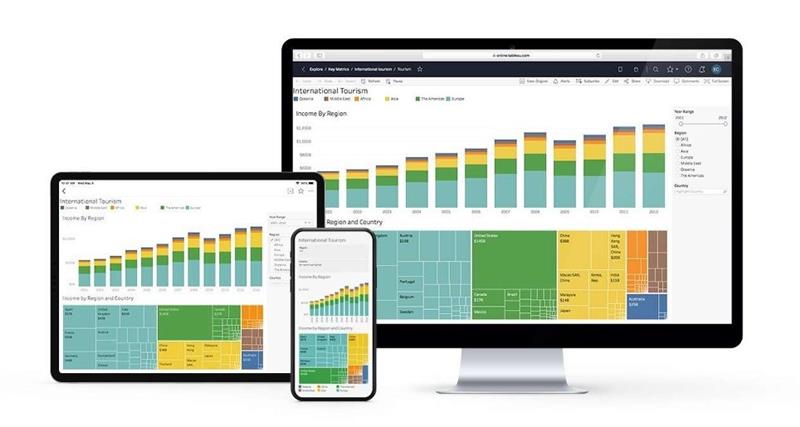
Tableau is a business intelligence and data visualization softwarethat enables intuitive and interactive data analysis, visualization, and sharing.
It was developed by the American company Tableau Software and has become one of the most popular tools for data analysis.
With Tableau, users can connect to awide range of data sources, such as databases, spreadsheets, text files, and cloud services, and createdata visualizations quickly and easily, without the need for advanced programming knowledge.
Visualizations can be customized and manipulated in various ways todiscover trends, patterns, and relationships in the data.
Tableau also offers the ability toshare viewswith others via the Web or on mobile devices, enabling effective collaboration among team members.
In summary, Tableau is a powerful and effective data analysis and visualization tool that can help organizations make informed decisions and gain a better understanding of their business data.
Basic Tutorial: how to create a data visualization in Tableau
In this Tableau tutorial, we will create a data visualization using anonline sales dataset.
We will follow these steps:
1. Download Tableau
Here is how to install Tableau Desktop on your computer:
N.B. Tableau Desktop ispaid software, but afree trial versionis available for a limited time. In addition, you can use TableauPublic, the free version of Tableauthat allows you to share visualizations on the Web, without the need to install the software on your computer.
2. Downloading the online sales dataset.
We download the online sales dataset from this link: https://community.tableau.com/s/download. It is a CSV file that contains information on products sold online, price, quantity sold, and date of purchase.
3. Load the dataset into Tableau
We open Tableau and select “Connect to Data” on the home screen. We select “Text File” and choose the downloaded CSV file. Tableau will automatically import the dataset and show us a preview of the data.
4. Create a basic data visualization
We drag the “Order Date” field from the “Date” pane onto the “Columns” shelf and the “Sales” field onto the “Rows” shelf. Tableau will automatically create a line graph showing sales over time.
5. Add a filter and pivot table
Let’s add a filter to our chart. We drag the “Category” field from the “Dimensions” pane onto the “Filters” shelf and select only the “Technology” category. The line graph will update to show only sales of technology products.
To create a pivot table, we drag the “Region” field from the “Dimensions” pane onto the “Columns” shelf. Tableau will create a table showing sales by region and year.
6. Customizing the display
We customize the visualization to make it more appealing and understandable. We can change the chart type from “Line” to “Area” and add a label for total sales. We can also add different colors for each region and add a legend for regions.
Once the customization is complete, we can save our visualization as a Tableau work file or share it with others via the Web or on mobile devices.
Thus, we created abasic data visualizationusing Tableau and learned how to customize the visualization to get a better understanding of the data.
If you wish, you can become more familiar with the product by following a tutorial such as the following.
Advanced features of Tableau
In addition to basic functionality, Tableau also offers a wide range of advanced featuresthat enable users toanalyze data in depthandcreate dynamic visualizations. With the help of these features, users can gain a deeper understanding of data and make more informed decisions.
Predictive and statistical analysis
Tableau offers a wide range of predictive and statistical analysis functions that enable users to perform advanced analyses on the data. For example, linear regression can be used to identify relationships between variables or clustering analysis can be used to identify patterns in the data.
Geolocation
Tableau has a built-in geolocation feature that allows users to view data on interactive maps. This allows users to quickly identify areas of data concentration and analyze data based on geographic location.
Data modeling
Tableau offers a wide range of data modeling functions that enable users to prepare data for analysis. For example, data from different sources can be merged, data can be transformed into different formats, and data can be cleaned to remove duplicate or missing data.
Collaboration
Tableau allows users to collaborate with other users in real time. For example, you can share dashboards with other users and allow them to interact with the data in real time. In addition, you can use the comment function to discuss data with other users.
Integration with other applications
Tableau can be easily integrated with other business intelligence and enterprise applications. For example, Tableau can be integrated with Salesforce to analyze customer data or with SAP to analyze financial data.
Automation of reports
Tableau offers a report automation feature that allows users to schedule report generation based on a specified time interval. This allows users to automate report generation and reduce the time required for report creation.
Forecast
Tableau offers a built-in forecasting function that allows users to perform forecast analysis on data. For example, the forecasting function can be used to predict future sales or market trends.
Differences with other business intelligence tools: Qlik Sense and Power BI
According to the Gartner Magic Quadrant of 2021 among the most competitive BI tools we haveTableau, Qlik Sense and Microsoft Power BI. We therefore close this article by analyzing the differences between Tableau and these 2 of its competitors.
Tableau vs Qlik Sense: differences
Tableau and Qlik Sense are business intelligence software that offer similar functionality, but with some significant differences. Here are some of the main differences between Tableau and QlikSense:
Architecture
Tableau uses a server-client based architecture, while Qlik Sense uses a cloud or server-based architecture. This means that Tableau requires the installation of a server to manage data and security, while Qlik Sense can be used as a cloud service or on a dedicated server.
User interface
Tableau has anintuitive and easy-to-use userinterface with a drag-and-drop approach to creating data visualizations.Qlik Sense uses a technology called“associative engine”that allows users to explore data more dynamically.
Analysis functions
Tableau is known for its advanced analysis functions, such aspredictive analytics and statistics.QlikSense focuses more ondata manipulationand visualization.
Scalability
Qlik Sense is designed to handle large volumes of dataand can handle more users than Tableau.Tableau is better suited foranalyzing small and medium volumes of data.
Price
The price of Qlik Sense depends on the version you choose, while Tableau has a single price for the desktop license and a separate server license.In general, Qlik Sense tends to be cheaper than Tableau.
Community
Tableau has alarge online communitywith numerous forums and resources available.Qlik Sense has a less developed, but still active and growing community.
For a more in-depth overview of Qlik Sense, also read our article Introduction to Qlik Sense, an Advanced Business Intelligence Platform.
Tableau vs Power BI: differences
Tableau and Power BIare popular business intelligence tools developed by different companies, Tableau Software and Microsoft, respectively. Here are some of the main differences between the two tools.
Architecture
As we have seen, Tableau uses a server-client based architecture, while Power BI is cloud or server-based. This means that Tableau requires the installation of a server to manage data and security, while Power BI can be used as acloud service or on a dedicated server.
User interface
Tableau has an intuitive and easy-to-use user interface with a drag-and-drop approach to creating visualizations.Power BI uses a technology called“Natural Language Query”to create visualizations more dynamically.
Analysis functions
Tableau is known for its advanced analysis functions, such as predictive analysis and statistics.PowerBIhas some advanced analysis functions, butit is not at the level of Tableau.
Scalability
Similar to Qlik Sense, Power BI is designed to handle large volumes of data and can handlemore users than Tableau.Tableau is better suited for analyzing small and medium volumes of data.
Price
Power BI has afree basic license with limited functionality, while Tableau has a single price for the desktop license and a separate server license. Therefore,Power BI tends to be cheaper than Tableau.
Community
Power BI is supported by a large online community of users and developers, while Tableau has a less developed but still active online community.
In general,Power BI is better suited for large companies that need scalability and a cost-effective solution, while Tableau is ideal for small and medium data analysis and advanced analysis functions.
Conclusion: which business intelligence software to choose?
In conclusion, all 3 toolsconsidered-Tableau, Qlik Sense, and Power BI-offersimilar functionalityfor analyzing data and creating dynamic visualizations, but with some significant differences that can also weigh heavily in the choice of tool. The choice of the best business intelligence software will depend on theuser’s needs, thesize of the project, and theavailable budget.
Condividi tramite