In this article we are going to delve into Qlik Sense, an advanced business intelligence platform that enables users to analyze large amounts of data quickly and intuitively. With Qlik Sense, users can create interactive dashboards, custom reports, and dynamic data visualizations that enable immediate data understanding and informed decision making.
In particular, we are going to develop a basic dashboard, and then introduce 3 very important, if somewhat more advanced, elements:
Qlik Sense: what it is and functionality
Qlik Sense is a self-service BI platform, which means users can create reports and dashboards without the need for advanced technical knowledge. The platform is designed to beintuitive and easy to use, with a range of drag-and-drop tools that allow users to create data visualizations quickly and easily.
The platform was developed by the Swedish companyQlik, founded in 1993, and was released in 2014. Qlik Sense is the natural evolution of QlikView, a business intelligence platform previously released by the company. With Qlik Sense, Qlik sought to create a more modern and user-friendly product that can be used by all users.
The benefits of Qlik Sense
One of the advantages of Qlik Sense is its ability to integrate with a wide range of data sources. In fact, the platform supports a variety of file formats, includingExcel, CSV, XML and JSON, and is able to access SQL and NoSQL databases, cloud services and many other data sources. This means that users can analyze data from many different sources, including marketing, sales, finance and human resources data.
Because of its associative architecture, QS enablesflexible and dynamic data analysis. Users can intuitively explore data, drill down in detail, and create associations between data that were not initially anticipated. In this way, Qlik Sense enables the discovery of new correlations and trends that might otherwise be hidden.
It also offers a wide range of advanced features for data analysis, including:
These features allow for in-depth data analysis and greater business insight.
Finally, Qlik Sense also offers a number of collaboration tools, which allow users to share their reports and dashboards with other users within the organization. In this way, users can work together to analyze data and make informed decisions.
Qlik Sense Tutorial: how to create a basic dashboard
In this basic tutorial on Qlik Sense, we will use an example to show how to create an interactive dashboard using several advanced features of the platform.
The example we will use involves thesales of an online clothing store.
Step 0: Download QlikSense
To download Qlik Sense, you need to follow these steps:
Once you have downloaded Qlik Sense, you can install it on your computer by following the instructions provided during the installation process.
Step 1: Load data into Qlik Sense.
In this example, the data were saved in a CSV file. To upload the data, click the “Upload Data” button in the left sidebar, then select the CSV file.
Suppose we have data on sales of various categorized products over a 2-year time period in various countries. You can find a similar dataset at the linkhttps://community.tableau.com/s/download
Step 2: Create the visualizations.
Once the data is loaded, you can create the visualizations for the dashboard. In this example, we will create four visualizations:
To create amap, drag the “Region” field to the “Dimensions” section of the map view and the “Sales” field to the “Measures” section.
To create a bar graph, drag the “Category” field to the “Dimensions” section of the bar graph view and the “Sales” field to the “Measures” section.
To create a line graph, drag the “Date” field to the “Dimensions” section of the line graph and the “Sales” field to the “Measures” section.
Finally, to create a table, drag the “Country” and “Sales” fields to the “Dimensions” and “Measures” section, respectively.
Step 3: Create filters and selections
To make the dashboard interactive, filters and selections can be created. In this example, we will create a filter to select the time period of sales and a selection to show sales for a specific country.
To create a filter, click the “Add Filter” button in the left sidebar and select the “Date” field. To create a selection, click on the country sales table and select the desired country.
Step 4: Add advanced features
Once the basic views and selections have been created, advanced features can be added. In this example, we will add a time series analysis function for the line graph and a drill-down function for the bar graph.
To add time series analysis to the line graph, click on the line graph and select the “Time Series Analysis “option from the drop-down menu. To add drill-down to the bar chart, click on the bar chart and select the “Drill-down” option from the drop-down menu.
Step 5: Create the final dashboard
Finally, you can combine views, either in a single tab or separate them into several separate sections navigable with the arrows in the upper right corner.
You can become more familiar with the tool by taking a course such as the following that is able to give us the basics of using Qlik Sense.
Using Set Analysis
Set Analysis is a powerful feature of Qlik Sense that allows you tocreate custom expressions based on a specific set of data.
Basically, Set Analysis allows you to define conditions to select a subset of data for use in an analysis, enabling you to create very precise and detailed expressions.
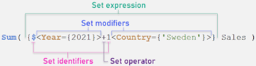
In this example, we will use Set Analysis to create a graph showing the total sales of our online clothing store only for customers who made at least 3 purchases.
Step 1: Define the dataset
To begin, we will define the dataset we will use in the Set Analysis expression. In this case, we want to select only customers who have made at least 3 purchases. So, we will define our data set as all customers who have made at least 3 purchases:
{
In this dataset, we are only selecting records where the distinct OrderID count is greater than or equal to 3.
Step 2: Create the expression Set Analysis
Once the data set is defined, we can use the Set Analysis expression to create our graph. In this example, we will create a bar graph showing total sales for selected customers from our data set:
sum({
In this expression, we are using the Sum function to calculate total sales and the Set Analysis syntax to select only those customers who made at least 3 purchases.
Step 3: Add the Set Analysis expression to the graph.
Finally, we will add the expressionSet Analysis to our graph. To do this, we drag the “SalesAmount” field to the “Measures” section of our bar graph and enter the expressionSet Analysis in the expression editor:
sum({
Once the expression is added, our bar graph will show only the total sales of customers who made at least 3 purchases.
In summary, Set Analysis is a very useful feature ofQlik Sense that allows you to create custom expressions based on a specific set of data. Using Set Analysis, you can create detailed and precise analyses that meet the user’s specific needs.
Using external extensions
Extensions in Qlik Sense are an extremely useful tool for customizing the appearance and functionality of our dashboards. In this tutorial, we will use an example to show how to use extensions in Qlik Sense.
Step 1: Download and install an extension
The first step in using an extension in Qlik Sense is to download the desired extension and install it in our Qlik Sense environment. There are many extensions available on Qlik Branch, a community of developers who share their extensions with other Qlik users. For this example, we will use the extension “D3 Sankey Diagram,” which is available on Qlik Branch.
To download the extension, simply go to the Qlik Branch site and search for the desired extension. Once found, click the “Download” button and save the ZIP file. Next, open Qlik Sense Desktop and click the “Extensions” button in the left sidebar. Click the “Import” button and select the ZIP file you just downloaded. Qlik Sense will automatically install the extension.
Step 2: Create a graph with the extension
Once the extension is installed, we can use it to create a custom chart in our dashboard. To do this, go to our dashboard and click the “Edit” button in the upper right corner. Then, select the sheet on which we want to add the chart and click the “Add Item” button in the left sidebar. Select “Extension” and choose the newly installed extension from the list.
In this example, we will use the “D3 Sankey Diagram” extension to create a graph showing the traffic flow on our website. We then select the “D3 Sankey Diagram” extension from the list and drag and drop the “Source,” “Destination,” and “Value” fields into the “Measures” section of the extension editor. We also configure the appearance of the diagram by selecting a theme, title, and width and height settings.
Step 3: Add the extension to our sheet
Finally, let’s add the newly created graph to our dashboard. Click the “Add Object” button and select “Chart” from the list. Then select the newly created “D3 Sankey Diagram” chart and configure it according to our preferences. Let’s save our dashboard and view it in presentation mode.
In this example, we used the “D3 Sankey Diagram” extension to create a custom chart showing traffic flow on our website. However, there are many other extensions available on Qlik Branch that allow us to further customize our Qlik Sense dashboards.
Implementation of custom extensions
Custom extensions in Qlik Sense allow developers to create custom objects that can be used within dashboards. These custom objects can be used to display data in an innovative way, integrate custom functionality, or provide a new user experience.
In this tutorial, we will see how to implement a simple custom extension in Qlik Sense.
Step 1: Create a new extension project
To create a new custom extension in QlikSense, we need a development environment. You can use any development environment of your choice, such as Visual Studio Code or Sublime Text. In this example, we will use Visual Studio Code.
Create a new folder for our extension and open Visual Studio Code. Then, open our extension’s folder inVisual Studio Code and create a new file “qlik-sense-extension.js”.This file will be the main file of our extension.
Step 2: Define our extension
In our file “qlik-sense-extension.js,” we will define our extension. We will define the extension name, version and other information. Then, we also define the input parameters that our extension will receive.
Step 3: Add our extension code
Once we have defined our extension, we can add the code needed to create our custom object. In this example, we will create a simple bar graph that displays the value of a field.
To create the bar graph, we will use the D3.js library. This library allows us to create custom charts usingJavaScript. We will then add the code needed to create our bar graph using D3.js.
Step 4: Test our extension
Now that we have written the code for our extension, we can test it within Qlik Sense. To do this, we can use the “Qlik Sense Dev-Hub.” Access the Dev-Hub through the browser, click on “Extensions” and then select “Upload Extension.” Select our extension from the computer and click “Open.”
Our extension will be loaded into Qlik Sense and we can test it by creating a new dashboard. Select the bar graph you just created and add it to the dashboard. Our bar graph should display the data for the selected field.
Step 5: Distribute our extension
Once our extension has been tested and is working properly, we can distribute it to other Qlik Sense users. To do this, we can create an extension package that contains our “qlik-sense-extension.js” file, along with any other necessary resources, such as CSS files or images.
Conclusions
As we have seen in this overview, Qlik Sense is really a very versatile business intelligence platform for performing big data analysis in a simple and intuitive way to enable users to instantly understand data and make informed decisions.
Condividi tramite